Grid Overlay Pro View Source Code
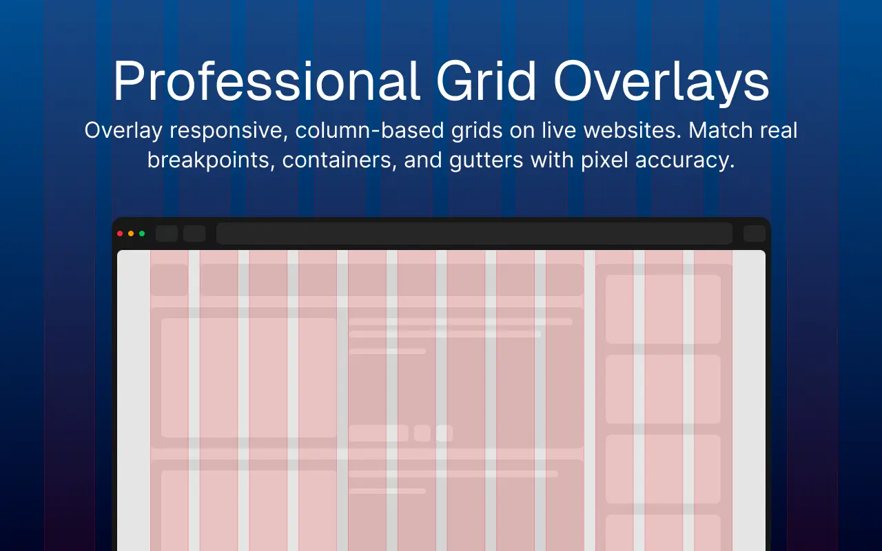
Bringing Figma-style grid overlays to any live webpage, making pixel-perfect alignment a browser-native part of the design process.
Overview
Grid Overlay Pro is a Chrome extension that lets developers and designers overlay fully customizable, responsive grid systems on any webpage in real time. It bridges the gap between design tool grid systems and browser-based implementation, removing the constant context switching between Figma, CSS, and DevTools during layout work.
The Problem
Design tools like Figma make grid systems visible. Browsers don't.
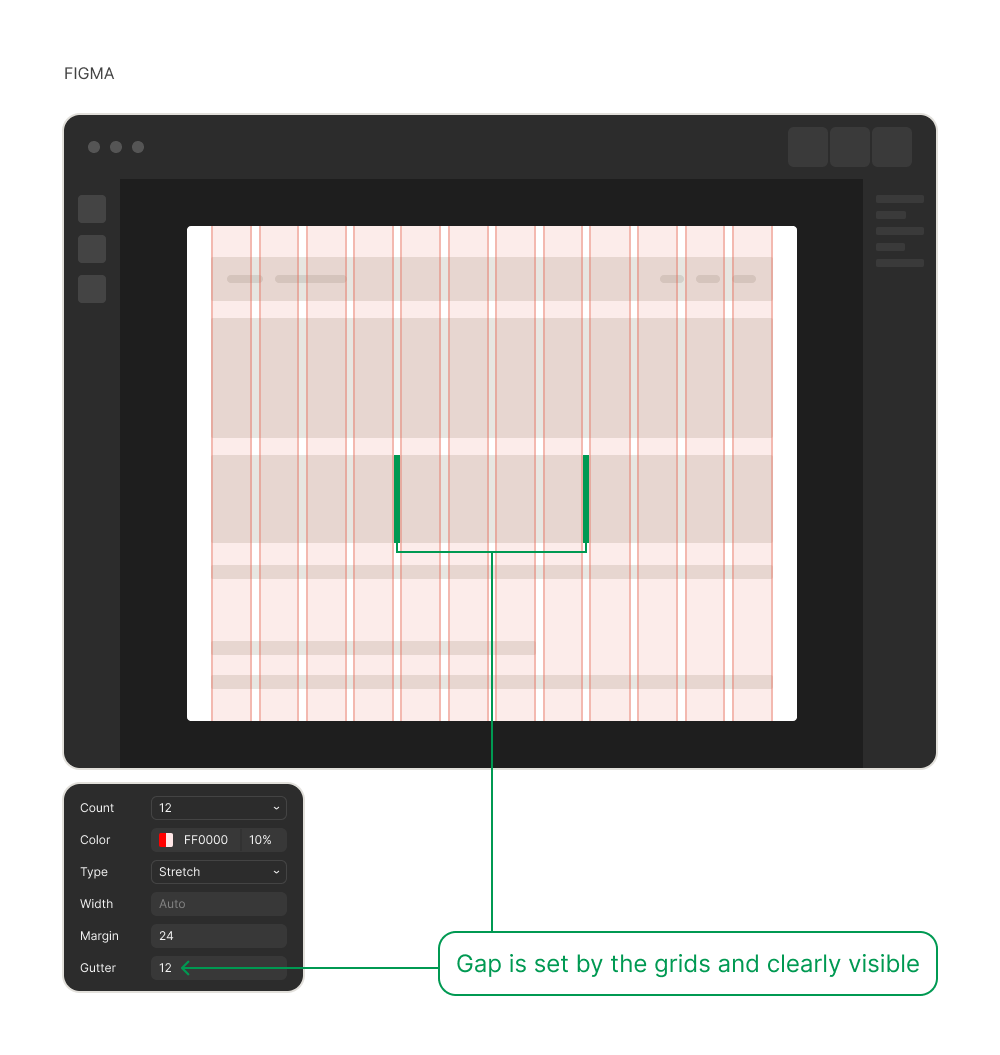
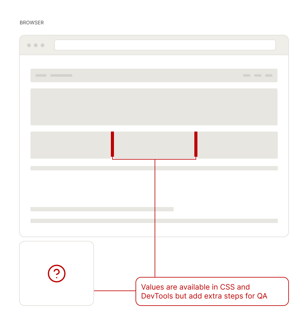
Verifying a grid system during development meant constant switching between CSS, the browser, and DevTools. The reference existed in the design file but not in the environment where the work was happening.
Iteration 1: Bookmarklet
The fastest path to a working grid overlay was a bookmarklet.
It worked, but any change meant going back into the code.
× Hard to customize
Changing any grid value means editing raw code and repacking the bookmarklet.
× One config only
No way to switch between different grid setups.
× No project management
Using separate bookmarklets for separate projects breaks down fast.
Looking at Existing Extensions
Before building further, I checked what was already out there.
| Extension | UI-based config | Custom breakpoints | Preset management |
|---|---|---|---|
| CSS Grid Overlay | JSON only | √ | Hidden |
| NOV Grid | √ | Max 3 | × |
| Grid Overlay | √ | × | × |
Every existing option had at least one critical gap. None combined a UI-based config, custom breakpoints, and preset management in the same tool.
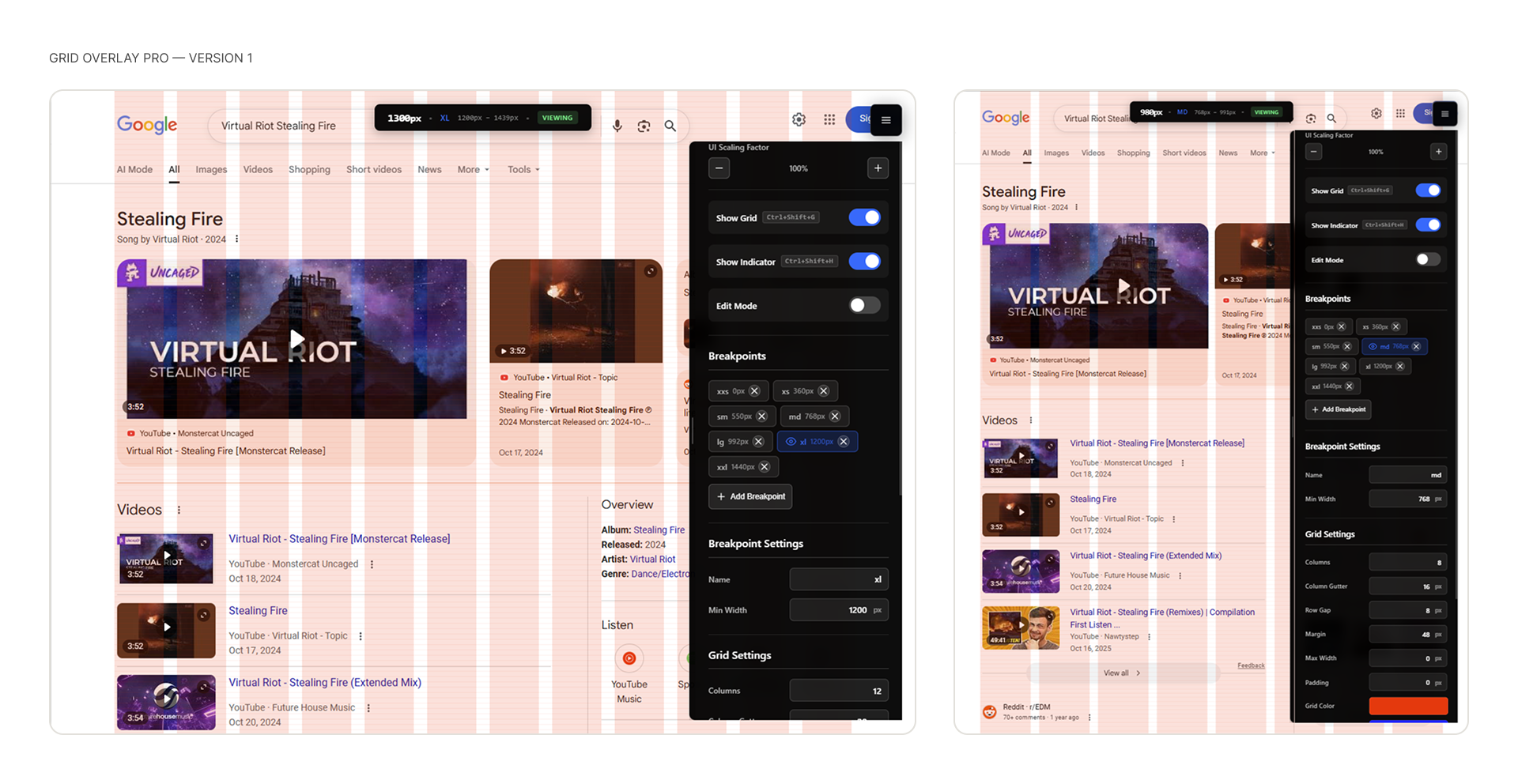
Iteration 2: Chrome Extension V1
A Chrome extension solved the repacking problem with a persistent UI panel and settings that persisted across sessions.
√ UI-based config
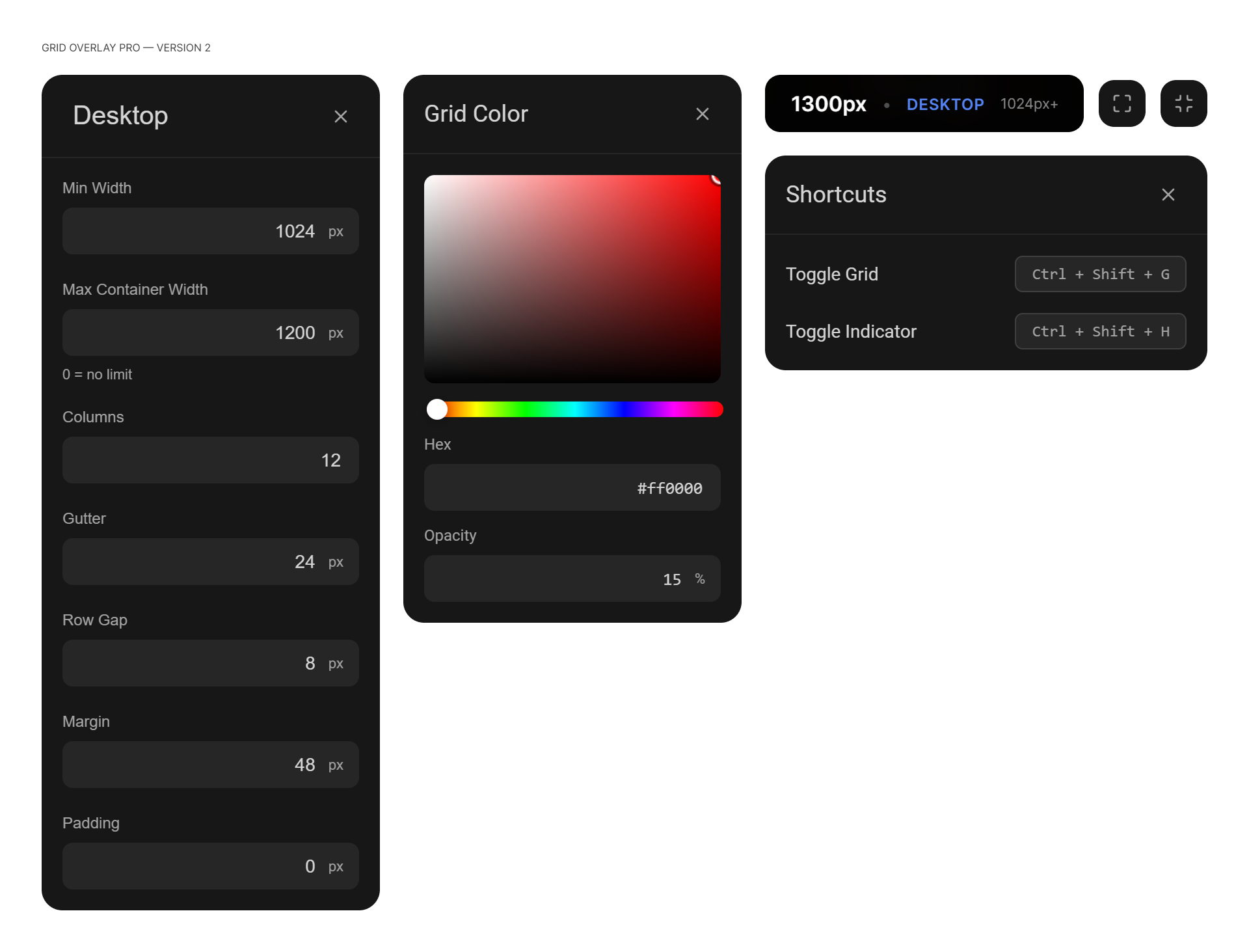
Adjust any grid value live from the panel — no code editing required.
√ Custom breakpoints
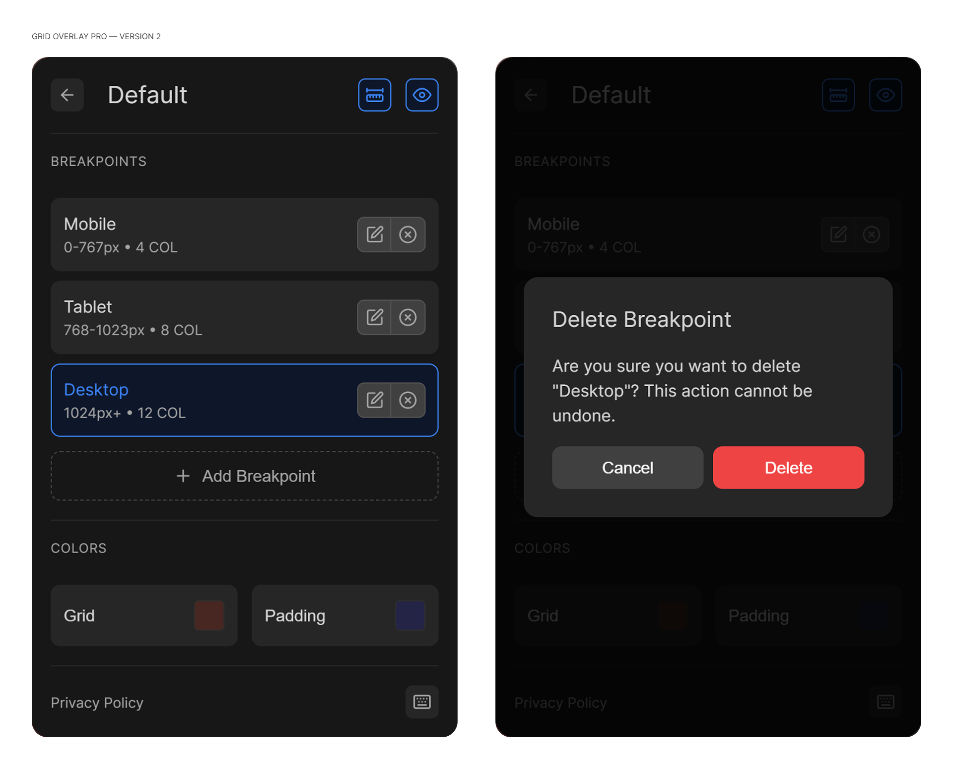
Define as many breakpoints as needed, each with its own grid configuration.
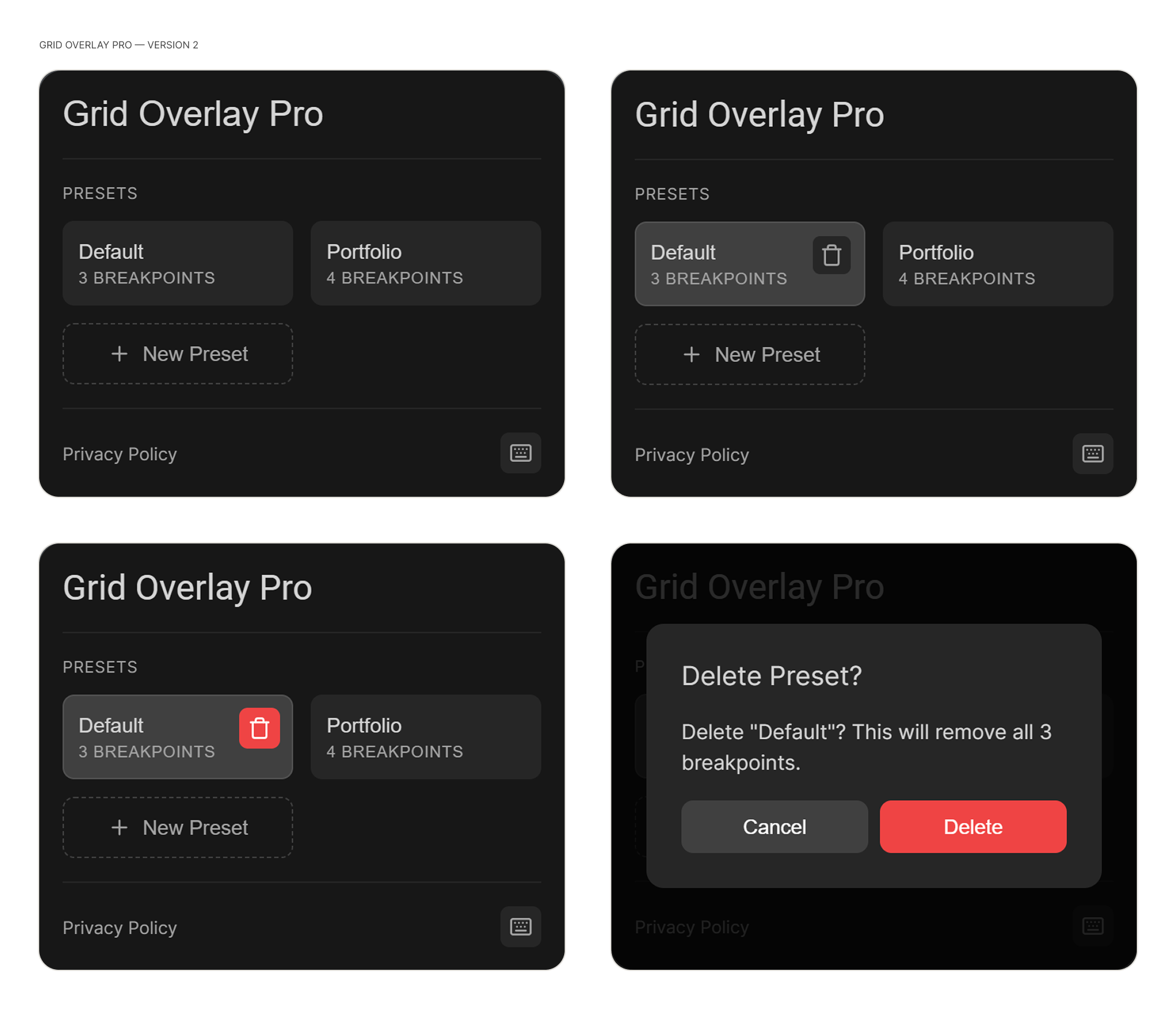
√ Preset management
Save, name, and switch between grid configurations across projects.
Testing
Testing revealed three categories of UX problems.
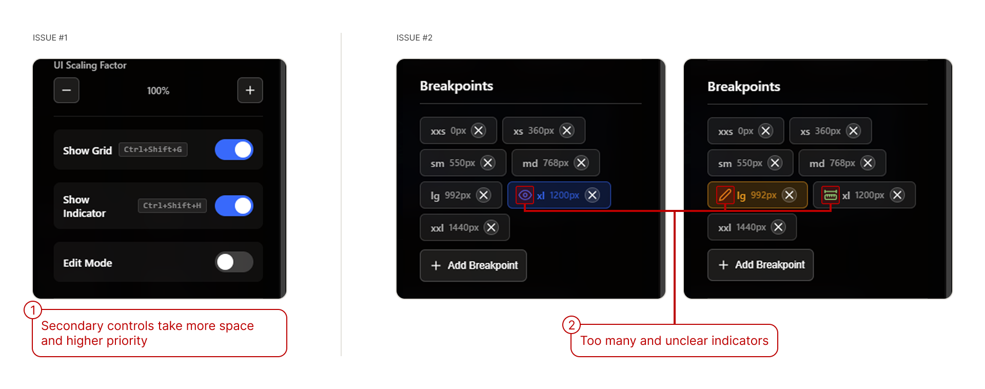
Hierarchy and Indicators
Secondary controls competed with primary ones for attention, and the breakpoint list used multiple overlapping indicators with no clear meaning.
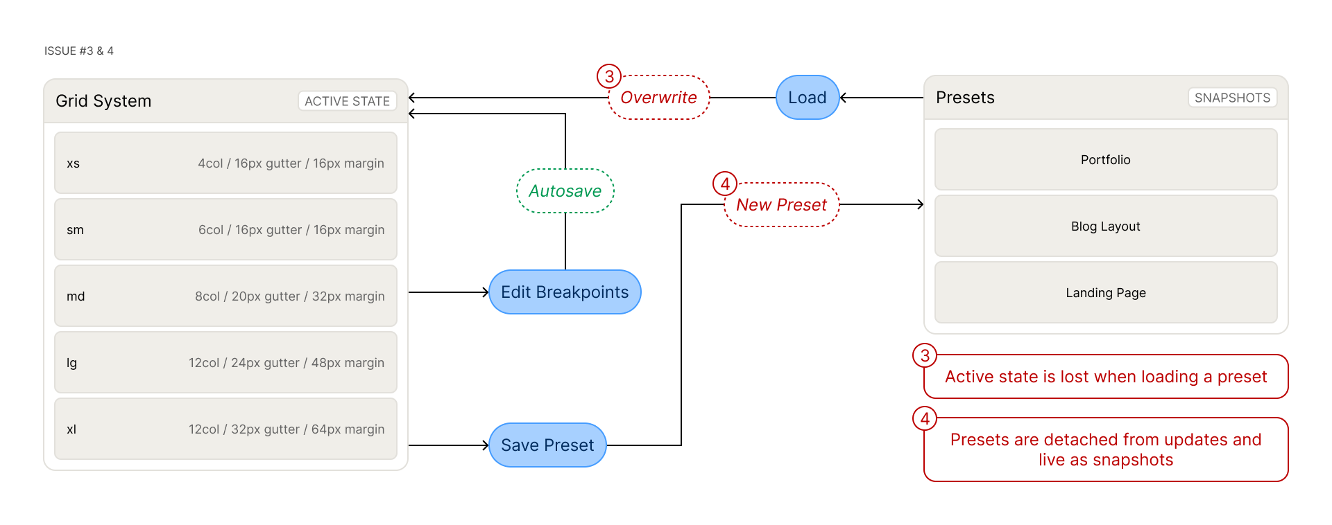
Data Model
Loading a preset overwrote the active working state, and saved presets were snapshots that didn't reflect any edits made after saving.
Information Architecture
Every control lived on a single screen, creating overload regardless of what the user was trying to do.

Iteration 3: Chrome Extension V2
The V2 redesign started with architecture — mapping the new structure in Figma before writing any code.
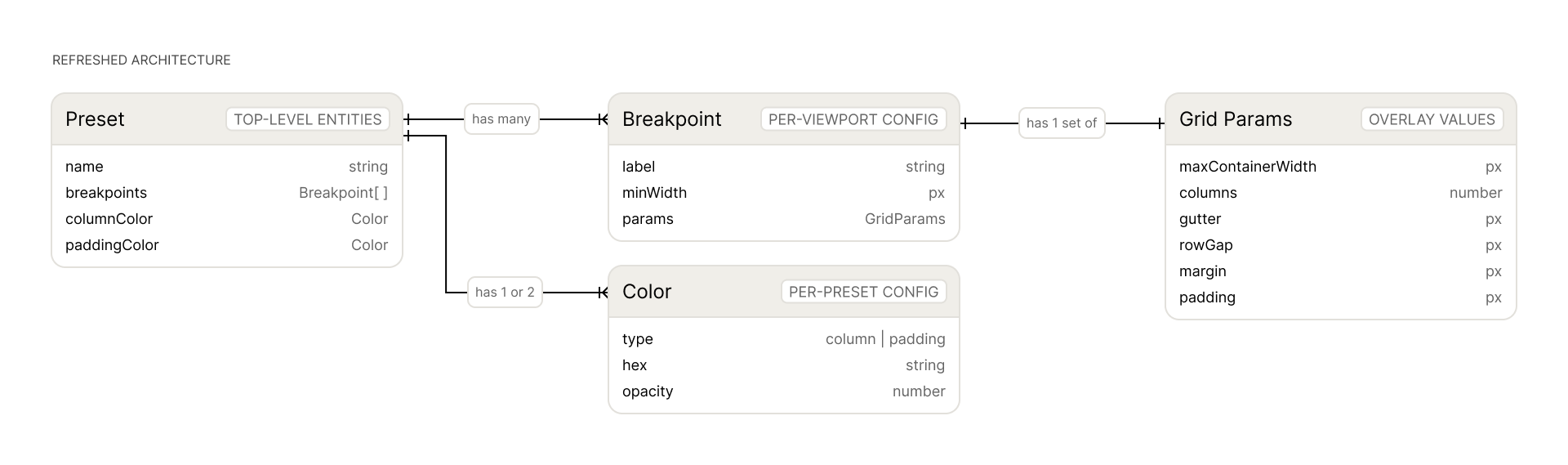
Refreshed Architecture
Presets, breakpoints, and grid params became separate screens instead of one overloaded panel.
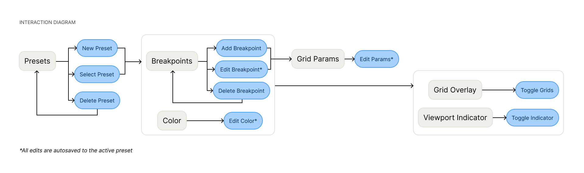
Interaction Diagram
Edits autosave to the active preset. One indicator marks the active breakpoint.
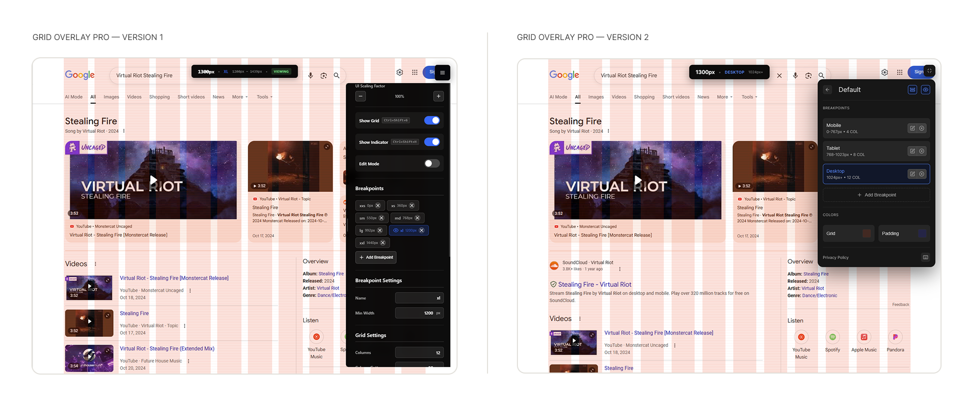
Version 1 vs Version 2
Screens
Outcome
194 users on the Chrome Web Store without a dedicated launch.
Learnings
Prototype to validate, redesign to scale
The bookmarklet proved the idea fast. Testing V1 revealed what actually needed fixing before any V2 code was written.
Real problems compound
Built for one project, it resonated with designers and developers hitting the same gap independently.
Design before code (eventually)
Mapping the architecture and interactions before writing V2 solved structural problems that a code-first approach couldn't have caught.